Titanic Design D: The Interior
Did You Know...
…that the interior arrangements in the original design for the Olympic-class ships, known as Design D, are just as varied from what was actually built as the external features we discussed in last week’s post?
While the lack of a second mast after and a clustering of the ship’s lifeboats along the after boat deck is certainly a visual departure from the Olympic-class liners we’ve come to know and love, passengers stepping aboard would have found the ships to be very different from the ones that eventually set sail in 1911 and 1912.
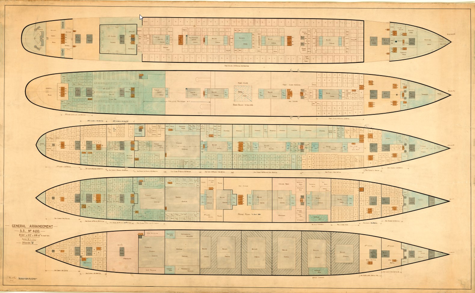
The most noticeable change would be the grand staircases. In both cases, these would have been more typical and rectangular staircases, similar to what we eventually saw in the Olympic-class’ second class spaces. The elevators, or lifts, would not have been located behind the forward grant staircase, but across from the front of the staircases, with a port and starboard elevator rather than a stand of three lifts.
A deck would be very similar in layout to what was eventually built, with the Lounge, Smoking Room, Palm Court, and Reading and Writing Room all located in the same spots and with the same general shape. The aft part of the deck would have been smaller without the protrusion for the mast and also seems to be lacking the large cargo cranes, although it’s unclear if these are just omitted in the drawings, as no cranes appear around any hatches.
B deck is very similar in design to the Olympic, with a large promenade space along the sides, but two major differences jump out from the drawing. The first is the lack of an A La Carte Restaurant for first class passengers. Instead, the second class smoking room is much enlarged. The more interesting change, however, comes near amidships, where there is a large space noted to be for a dome over the first class Dining Saloon. Olympic and her sisters would have a single-deck space for first class to dine, a radical departure from the grand, multi-deck spaces on other large liners built in England, Germany, and France. Design D, at least in this respect, places the Olympic-class ships closer to their contemporaries. This space is also marked on the plans for C deck. In both cases, this unbuilt dome would have taken up space later used for cabins and other small rooms.
C deck is otherwise a near-mirror for the as-built ships, with only minor changes to the number and shape of rooms. D deck, however, is radically changed. The first class entrance and a second lounge space, what was later termed the reception room, is much larger in the original plans. Ironically, the final reception room was considered to be a bit too small. The major change here is that the entrances are not walled off from the staircase landing, providing a more open space without altering the rest of the floor plan. Interestingly, the otherwise typical staircase fans out on D deck into a shape more recognizable to our eyes. It is interesting to ponder what Design D’s Dining Saloon would have looked like with a two-deck dome space in its center. The third class General Room is housed here near the stern, as opposed to opposite the Smoking Room for that class on C deck in the final design.
E deck holds little more than a few minor alterations, but F deck provides yet another surprise. The Gymnasium, to eventually be found on the starboard side of the Boat Deck, is on the starboard side here instead. The Turkish Bath area is shifted to the port side, where spaces for stewards were eventually located. While this seems a jarring change to us now, this may have been a more practical one in 1912. Olympic and Titanic did not have spaces for changing attached to their Gymnasium. Passengers using the facility would’ve had to pass through public spaces to change, something that would’ve been odd for the times. Most ships that housed a gymnasium at the time had it in the same location as found in Design D.
G Deck holds our final major surprises, with the omission of a Squash Court forward being among two notable changes. The other is the location of the ship’s Post Office. Unlike in the final design, where the Post Office was forward on G Deck, Design D places it on the starboard side, but far aft in an area eventually occupied by third class berths. This would certainly have changed some of the story on the night of 14 April 1912, when the mail clerks were among the first to report that their area of the ship was flooding fast.
Design D, like most initial designs for any structure, shows a lot of similarities with the what was finally built several years later, but it also shows some interesting differences, some that would’ve advanced beyond typical designs of the time and some which would’ve been a step backward from what eventually became Olympic and Titanic. It is fascinating to look at these designs today and imagine just how different these ships could’ve been.
Written By: Nick DeWitt
Photo Credit: Titanic Connections Archive


